WHAT’S THE BEST PICTURE OF CLIMATE CHANGE?
A COLLECTION.
SEE IT: TOOLS, IMAGES, MAPS
A new generation of interactive tools based on geographic data allows people to focus on what typically matters most to them: their home town, company headquarters, travel destinations, family. The New York Times offers an excellent suite of these functional maps, most recently, “The Most Detailed Map of Auto Emissions in America.” Click here for more, and plug in to the location that interests you. Below: Chicago.

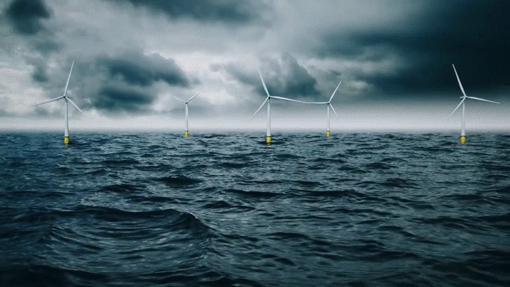
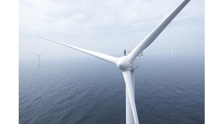
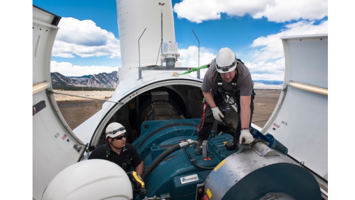
Which of these three wind turbine images will people like most? Experts say that showing people working safely and productively on climate solutions are most engaging. So, as majestic as the Block Island deepwater wind installation is; and as cool as that tiny wind tech guy is on the giant turbine; the third image is likely to be the one that people will talk about and share with others. Explain that these two men are part of a Veteran’s employment program, and you’ll spark interest in the new jobs presented by the clean energy transition. The US Department of Labor reports that the top growing jobs in the US are wind technician and solar installer: solar photovoltaic installers are expected to grow 105% from 2016 to 2026, with $42,680 2018 median pay; wind turbine service technicians will grow by 96% over the same time frame, with median pay $54,370. Source.

SLED DOGS WADE THROUGH RECORD ICE MELT.
A spike in Arctic temps made possible this image of sled dogs wading through surface water melt. It’s a great photo to share because it shows how record sea ice melt is causing rapidly changing conditions for climate scientists, and helps us understand the connection to sea-level rise, which is a concern for those of us who live & work in coastal cities.
“Our climate model simulations expect there to be a general decline in the length of the sea ice season around Greenland, [but] how fast and how much is very much dependent on how much global temperature rises.”
— Ruth Mottram, climate scientist at the Danish Meteorological Institute. Her colleague Steffen Olsen took the shot June 13, 2019 on a routine mission through the Inglefield Gulf in northwest Greenland.
June, 2019. Temps rose by 40F (!! 22.2C).